skip to main |
skip to sidebar
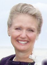
 My daughter Mary was the inspiration for choosing maternity jeans for the Description brochure. I snapped this picture a couple of weeks ago at her shower.
She is due today and she just called after her doctor's visit. Aiden isn't ready for his debut, maybe in a week or so.
Recently, Mary grumbled to her girlfriend Amy that she felt practically planetary. Amy offered to drop small objects in Mary's vicinity to see if they would begin to orbit.
I don't think my sense of humor was nearly this developed when I was her age.

 A roll fold with five panels seemed like a good solution to showcase maternity jeans. It introduced, and progressed images and copy supporting the notion that maternity pants can fit well, be attractive and comfortable throughout a pregnancy and afterwards. The goal was to keep the images, copy and type very clear and clean, but pretty.
In the first iteration, some of the wording was too blunt. The challenge was figuring out how to deliver a clear message softly. The design of the jeans addressed the needs of the audience—women who are interested in looking good during their pregnancies but to whom comfort is a real issue. I wrote the copy to educate women in their first pregnancies about how their shapes change and to inform women who are in a second or later pregnancies about the particular discomforts the design of the jeans relieves.
The rounded logo was created to look as if it just took a breath and there was room to do so comfortably. A sans serif font, Myriad Pro, supported the simplicity of the design and looked good with the logo. The illustrations, created to support the copy, show a woman progressing through her pregnancy wearing Ah jeans, showcasing the three items making them comfortable: The soft band (in the primary illustrations), the adjustable tabs and the bit of elastic in the front seam (in the little circles).
A split complement seemed like a natural color choice for this mailer. Washed denim blue was the obvious first choice with soft rose and gold colors completing the palette.
I worry that the flier might appear too simple. It meets the assignment, solving the challenges: don’t use a standard brochure format, describe the product to the target audience. I could have created a more sophisticated design, but I think this design would be very effective.
 My daughter Mary was the inspiration for choosing maternity jeans for the Description brochure. I snapped this picture a couple of weeks ago at her shower.

